Choosing a timeless colour palette is an art that merges personal style with an understanding of how colours shape a space and evoke emotions. How do you choose a timeless colour palette? It’s about looking beyond current fads and selecting hues that will maintain their appeal over the years. A well-considered colour palette not only enhances the aesthetic of a room but also creates a sense of lasting elegance that defies the whims of fleeting trends.
To embark on this journey of colour palette selection, one must consider the interplay of natural light within the space, as well as the existing elements that will define the foundation of your design. By thoughtfully integrating classic tones with modern sensibilities, you can curate a timeless colour palette that resonates with both comfort and sophistication.
Understanding the Importance of Colour in Design
The importance of colour in design extends beyond mere aesthetics; it profoundly influences emotional reactions and perceptions. Choosing the right colours can transform an ordinary space into an extraordinary environment, inviting individuals to connect deeply with their surroundings.
Emotional Impact of Colours
The emotional impact of colours is remarkably powerful. Different shades evoke distinct feelings; for example, blue often conveys a sense of tranquility, while vibrant yellows can foster a feeling of happiness and warmth. Understanding these emotional responses allows designers to create intended atmospheres and experiences within a space. Engaging with colours on this level enables effective storytelling through design, making spaces resonate with their occupants.
The Role of Colour in Space Perception
Colour in space perception plays a crucial role in defining an area’s character. Lighter colours can visually expand a space, giving the illusion of a larger area, while darker hues tend to create a more intimate setting. This knowledge is vital for designers seeking to enhance the spatial experience within homes or commercial environments. By carefully selecting colours that align with their design goals, one can influence how a space feels and is used.

How do you choose a timeless colour palette?
Choosing a timeless colour palette requires careful consideration of various aspects, most notably your space’s natural light and the existing elements present in the environment. Understanding these factors will enhance your colour selection process and contribute to a harmonious aesthetic.
Assessing Your Space’s Natural Light
Assessing natural light plays a pivotal role in how colours are perceived within a room. The type of light can change the apparent hue and intensity of colours throughout the day. North-facing rooms typically benefit from cooler, subdued light, making warmer tones a preferable choice. Conversely, south-facing spaces are drenched in sunlight, allowing for bolder and brighter colours. Recognising the direction and quality of light in your space will guide you in determining which colours will thrive and feel timeless.
Identifying Existing Elements to Work With
Identifying existing elements such as furniture, flooring, and architectural details is essential when curating a colour palette. These elements provide crucial context and can inform your choices significantly. For instance, a rich timber floor may lend warmth to a cool palette, while ornate mouldings might inspire lighter or neutral tones. Working with these established features allows for a cohesive and enduring design that celebrates both the old and the new.
Choosing Colours That Stand the Test of Time
Creating a timeless colour palette requires careful thought, particularly in selecting hues that retain their appeal over the years. An effective strategy involves understanding the effectiveness of neutrals paired with classic accent colours. This combination not only offers sophistication but also flexibility in design, allowing spaces to evolve without a complete overhaul.
The Effectiveness of Neutrals
Neutrals like whites, greys, and beiges provide a serene foundation that can complement various styles and elements. Their subtlety allows other colours to shine without conflict. Choosing colours that stand the test of time necessitates the incorporation of these versatile shades, ensuring that rooms maintain a sense of balance while accommodating occasional updates in decor.
Incorporating Classic Accent Colours
Classic accent colours such as navy blue, deep green, and rich burgundy add a layer of depth and warmth to any space. These hues not only stand the test of time but also enhance the overall aesthetic appeal. By thoughtfully integrating these shades, one can achieve an inviting and stylish environment that speaks to both personal taste and enduring design principles.
Creating a Timeless Colour Palette: Practical Tips
When embarking on the journey of creating a timeless colour palette, practical tips can make all the difference. By utilising colour theory effectively, designers and homeowners alike can refine their choices. Understanding which colours work harmoniously allows for a space to resonate emotionally with its inhabitants.
Utilising Colour Theory in Your Selection
Colour theory serves as a guiding principle in the selection process. This knowledge helps in identifying complementary and contrasting colours that can elevate the overall aesthetic. For instance, using a colour wheel enables the discovery of harmonious combinations that evoke specific feelings. Gravitate towards shades that align with the desired mood of your space, always keeping the ethos of creating a timeless colour palette in mind.
Testing Colours Before Committing
Before finalising a colour scheme, testing colours in the actual environment is crucial. Applying paint swatches on walls allows for the observation of light interactions throughout different times of the day. By doing so, individuals can better gauge how colours shift and contribute to the overall atmosphere. This practice not only aids in making informed decisions but also solidifies the essence of a cohesive, long-lasting colour palette.
Selecting Everlasting Colours for Longevity
When it comes to creating enduring spaces, selecting everlasting colours is key to achieving a design that remains stylish through changing trends. By choosing shades that evoke a sense of timelessness, one can craft an environment that feels both inviting and sophisticated.
Popular Timeless Colour Combinations
Several colour pairings have stood the test of time, serving as effective choices across various design styles. Popular timeless colour combinations include:
- Navy and white, which create a classic nautical feel
- Grey and beige, offering a soft, neutral backdrop
- Earthy greens with browns, invoking a sense of nature
These combinations offer versatility, making them suitable for everything from modern interiors to more traditional settings.
How to Refresh a Classic Palette
Refreshing a classic palette breathes new life into familiar spaces. Subtle changes can make a significant impact without altering the foundational colours. Consider incorporating new accent shades or updating accessories to rejuvenate your design. Small details like cushions, artwork, or decorative objects can effectively refresh classic palettes while retaining the overall aesthetic.
Inspiration from Timeless Colour Schemes
Exploring inspiration from timeless colour schemes can unveil a diverse range of sources that enrich the design process. Historical designs, with their intricate palettes, encourage a fusion of classic styles with contemporary aesthetics. Ancient art and architecture, particularly from cultures like the Greeks and Romans, showcase a mastery of colour that remains relevant even today.
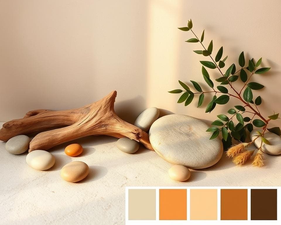
Nature is another rich wellspring for selecting a timeless colour palette. The hues found in landscapes, such as the tranquil shades of a sunset or the earthy tones of a forest, lend an organic sophistication to interior spaces. Additionally, observing how various cultures utilise colour in festivals and traditional garments can inspire unique pairings that balance modern sensibilities with deeply-rooted practices.
Staying updated on trendwatching in the design industry further aids in the creation of a timeless colour palette. Certain colour combinations often experience resurgence in popularity, providing opportunities to blend personal inclinations with broader appeal. By embracing this cross-pollination of ideas and historical references, designers can pioneer innovative yet classic designs that stand the test of time.