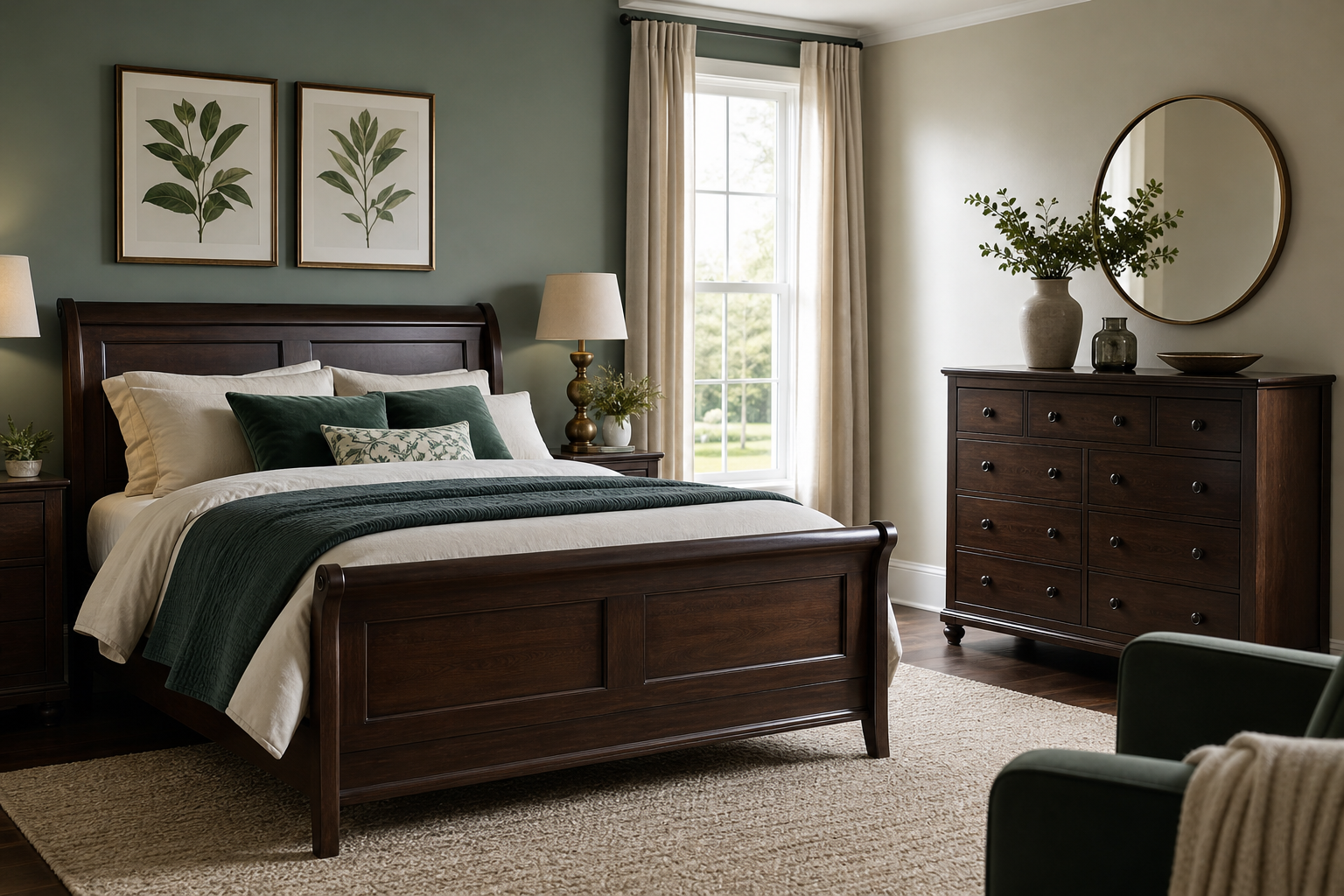

Dark timber has a lasting place in commercial interiors, from boardrooms and boutique hotels to restaurants, reception areas and executive offices. Yet one practical question appears again and again: Which Colours Work Best with Dark Wooden Furniture? The answer depends on the mood a business wants to create, the amount of natural light available and the role of each space. With the right palette, dark wood can feel premium, calm and contemporary rather than heavy or old-fashioned.
Why Dark Wooden Furniture Needs Careful Colour Planning
Dark wooden furniture has visual weight. Mahogany, walnut, dark oak, wenge and stained finishes can anchor a room strongly, which is useful in professional settings where stability and quality matter. However, if the surrounding colours are too dark, flat or cold, the space may feel enclosed.
Colour planning helps balance that depth. Walls, flooring, upholstery, curtains, artwork and accessories all affect how dark furniture is perceived. A pale wall can make a dark desk look sharp and architectural. A warm neutral can soften heavy cabinetry. A deep green or navy can create a refined, members’ club atmosphere when used with discipline.
For B2B interiors, the goal is rarely just personal taste. Colour choices need to support brand character, staff comfort, guest experience and durability. A palette that works in a private study may not translate well to a busy hotel lobby or client-facing meeting suite.
Which Colours Work Best with Dark Wooden Furniture? Core Palettes
The most effective colours tend to fall into a few reliable groups. Each creates a different commercial impression, so the best option depends on the setting and desired tone.
Warm Neutrals for Professional Comfort
Warm neutrals are among the safest and most versatile choices. They reduce contrast without making the room feel dull. Shades such as ivory, stone, oatmeal, taupe, warm grey and soft beige sit comfortably beside dark timber.
These colours work well in offices, serviced apartments, restaurants and waiting areas because they feel calm and familiar. They also suit mixed materials, including leather, brass, linen, wool and ceramic finishes. In a boardroom, a warm neutral wall behind a dark wooden table can create a composed backdrop for meetings without distracting from screens or presentations.
The key is to avoid neutrals that are too yellow or too flat. A balanced undertone will make the wood grain look richer, not orange or dated.
Soft Greens and Earthy Shades
Green is a strong partner for dark wooden furniture because it reflects colours found in nature. Sage, olive, eucalyptus, moss and muted forest green all work especially well with walnut and dark oak.
In hospitality, these shades can create a relaxed, grounded atmosphere. In workplace interiors, they can make breakout spaces or quiet rooms feel less corporate without losing professionalism. Earthy colours such as clay, terracotta, mushroom and muted ochre also work well, especially when the design scheme includes plants, textured fabrics or handmade-looking finishes.
Used carefully, these colours bring warmth and character. Used excessively, they can become too themed, so many commercial schemes apply them as accent walls, upholstery or artwork rather than across every surface.
Light Colours That Lift Dark Wood
Light colours are useful when the furniture is substantial or the room has limited daylight. They create contrast, highlight the shape of the furniture and prevent the scheme from feeling weighed down.
Good light colours include:
- Soft white: clean and simple, especially suitable for modern offices and galleries.
- Warm ivory: gentler than bright white and flattering beside traditional timber.
- Pale greige: a practical bridge between grey and beige for flexible commercial spaces.
- Powder blue: fresh and calm, particularly effective in meeting rooms or bedrooms.
- Pale sage: light enough to lift the room while still feeling organic.
Pure brilliant white can work, but it needs care. Against very dark furniture, it may produce a sharp contrast that feels stark. In many UK interiors, where daylight changes throughout the year, off-white or warm white is often more forgiving.
Ceilings also matter. A lighter ceiling keeps the room open, especially where dark bookcases, desks or dining furniture dominate the lower half of the space.
Deep Colours for a Premium Interior
Dark wooden furniture can also sit beautifully with rich, deep colours. This approach suits businesses that want a luxurious, intimate or heritage-inspired atmosphere. It is common in boutique hotels, fine dining spaces, private offices and members’ lounges.
Navy, charcoal, bottle green, aubergine and deep burgundy can all work with dark wood. The result is confident and atmospheric rather than light and airy. To make the palette successful, contrast must come from somewhere else: lighting, metallic finishes, pale stone, mirrors, glass, artwork or lighter upholstery.
For example, a dark walnut dining table in a restaurant can look refined against navy walls if the chairs are upholstered in tan leather and the lighting is warm. A charcoal reception desk can feel elegant when paired with brass details and pale flooring.
The main risk is creating a room that feels too enclosed. In commercial interiors, this can affect comfort and usability. Deep colours are strongest when supported by layered lighting and enough visual breaks.
Colours to Use with Caution
Some colours can work with dark wooden furniture, but they need more control. Bright primary colours may compete with the richness of the wood. Cool greys can make some timber finishes appear dull or slightly lifeless. Strong orange, red or yellow may intensify warm undertones in the wood and create a dated effect.
This does not mean these colours should be avoided completely. A burnt orange cushion, a red artwork or a mustard chair can add energy. The issue is scale. Large areas of strong colour may overwhelm the scheme, while smaller accents can bring personality.
Businesses should also consider brand colours carefully. A corporate colour may not suit every wall or fabric choice. It can often be used more effectively through signage, artwork, decorative objects or limited upholstery rather than across the whole room.
Matching Colour Choices to Commercial Settings
Different business environments call for different moods. Dark wooden furniture can be adapted to each, provided the surrounding colours are chosen with purpose.
In a law firm or financial office, warm whites, stone, taupe and deep blue can suggest trust and discretion. In a hotel bedroom, ivory, sage, muted blue or soft clay can make dark furniture feel restful. In a restaurant, earthy green, terracotta, burgundy or charcoal can add atmosphere and depth.
For retail interiors, the best colours depend on the product. Pale walls can help merchandise stand out, while dark green or navy may support a premium positioning. In healthcare, wellbeing or care settings, softer colours such as pale sage, warm grey and oatmeal are often easier to live with than dramatic dark tones.
The same piece of dark furniture can therefore look formal, relaxed, luxurious or contemporary, simply through its colour context.
Practical Tips for a Balanced Scheme
A successful palette is not only about the wall colour. The whole room must work together, especially in business interiors where lighting, maintenance and visitor perception all matter.
Useful principles include:
- Balance dark and light surfaces: pair dark desks, tables or cabinets with lighter walls, ceilings or flooring.
- Check undertones: warm woods often suit cream, taupe, olive and terracotta, while cooler stained woods may suit greige, blue or charcoal.
- Use texture to soften contrast: wool, linen, leather, boucle and matt paint can stop the scheme feeling harsh.
- Layer lighting: dark wood absorbs light, so combine ceiling, wall, task and accent lighting where possible.
- Limit accent colours: one or two accent shades usually look more considered than several competing colours.
Sample colours should be reviewed in the actual space. Artificial lighting, daylight direction and floor finish can all change how a colour appears beside dark timber.
Frequently Asked Questions
Do dark wooden tables need light walls?
Light walls are not essential, but they are often the easiest way to balance dark wooden tables. Warm white, ivory, pale greige and stone shades can make the furniture stand out clearly while keeping the room open and professional.
Can grey work with dark wooden furniture?
Grey can work well, especially when it has warm undertones. Very cool grey may make dark wood feel flat, so greige, taupe-grey or charcoal with warm lighting is usually more successful in commercial interiors.
What accent colours look good with dark wood?
Good accent colours include sage green, navy, brass, burgundy, terracotta and muted blue. The best choice depends on the business setting, the wood tone and whether the room should feel calm, premium or energetic.
Final Thoughts
Dark wooden furniture is highly adaptable when the colour scheme is planned carefully. Warm neutrals create comfort, pale shades add lift, greens feel natural, and deep colours bring drama and refinement. For commercial interiors, the strongest results usually come from balance: enough contrast to keep the space fresh, enough warmth to respect the timber, and enough restraint to support the purpose of the room.