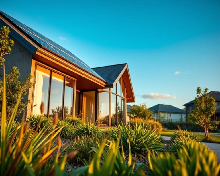
In today’s fast-paced world, transforming your living space into a serene retreat is more vital than ever. The right paint colours play a significant role in fostering a calm home vibe, helping to create an environment conducive to relaxation and well-being. By exploring tranquil hues, you can enhance your home design to evoke feelings of comfort and peace. This article will guide you through various colour choices that can make your home a sanctuary, offering inspiration to achieve that much-desired tranquil atmosphere.
The Psychology of Colour in Home Design
Exploring the intricacies of colour psychology unveils a fascinating connection between hues and human emotions. The emotional impact of colours plays a critical role in home design, influencing everything from our mood to our overall well-being. Understanding how various shades affect feelings can empower homeowners to create spaces that resonate with their desired atmosphere of home.
Understanding Colour Psychology
Colour psychology delves into the ways colours evoke specific emotional responses. For instance, certain calming colours, such as soft blues and greens, can instill peace and tranquillity, while vibrant hues like orange and yellow can invigorate and energise spaces. By recognising the emotional interior design potential of these colours, individuals can strategically select shades that align with their emotional needs, thereby enhancing their daily experiences at home.
Impact on Mood and Emotions
The colours chosen for a particular area can profoundly shape the mood within that space. Warm, inviting tones foster a sense of comfort, ideal for social gatherings. In contrast, cooler shades provide a serene environment, perfect for relaxation. Research suggests that using mood enhancing colours can alleviate stress and contribute to a calming atmosphere. The thoughtful application of these principles in home design allows one to cultivate a harmonious emotional landscape, ideal for nurturing well-being.
What paint colors create a calm home vibe?
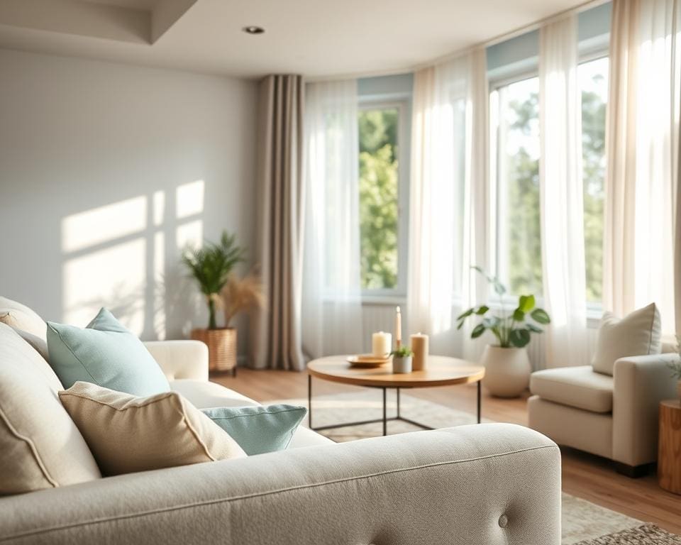
Creating a serene environment in your home begins with selecting the right paint colours. Focus on hues that evoke a sense of tranquility while complementing your space. Calm paint shades play a vital role in shaping the atmosphere, impacting not just aesthetics but also overall wellbeing. The right colour can enhance the light conditions and dimensions of your rooms, reinforcing a sense of peace.
Choosing the Right Shades for Your Space
When it comes to tranquil home colours, a range of options can help set the mood. Soft blues and greens often emerge as popular choices, fostering a sense of calm. Consider incorporating pastel shades that can bring warmth to your spaces while avoiding overwhelming tones. Here are some interior design tips for selecting calming colours:
- Opt for soft blues paired with muted greys to create a peaceful workspace.
- Choose gentle greens that represent nature, promoting focus and grounding.
- Embrace soft neutrals, such as beige and taupe, for versatile backdrops.
- Pastel colours, like light pinks and lavenders, can make small areas feel larger and airier.
Each of these alternatives offers distinct benefits for creating a relaxed environment. By using calming colour schemes, you can further enhance your home’s atmosphere. Remember, your personal preference plays a significant role in achieving a connection with your space, thus ensuring that the colours resonate with you on a deeper level.
Soft Neutrals for a Tranquil Atmosphere
Creating a calming home environment often begins with the selection of soft neutrals. These hues, including shades of beige, taupe, and gentle grey, serve as a perfect base for interior design. Their versatility allows them to adapt seamlessly to various decorative elements, enhancing the overall aesthetic while providing a tranquil atmosphere. Such calming neutral colours can transform spaces into serene retreats, making them an ideal choice for areas meant for relaxation.
Popular Neutral Tones
When considering popular neutral tones, it’s vital to recognise the unique benefits each shade brings. Soft neutrals can enhance the perception of space, making rooms feel lighter and more open. Combining various neutral colour benefits offers an intriguing yet non-distracting palette. Options like warm beige paired with soft grey or taupe with splashes of ivory encourage a harmonious flow throughout the home.
How Neutrals Enhance Serenity
Utilising soft neutrals fosters a sense of balance and serenity in design. They reduce visual noise characterised by brighter colours, allowing the mind to rest. Incorporating earthy tones such as muted greens or sandy beiges can enhance the calming effect within your space. Opt for natural materials such as wood and stone to further enrich this calm vibe. By layering textures and mixing tranquil tones with warm accents, homeowners can create a welcoming atmosphere that embodies warmth and peace.
For more inspiration on creating a peaceful vibe in your home, explore the benefits of neutral colours. With thoughtfully chosen soft neutrals, the journey to achieving a serene oasis in your living space becomes remarkably attainable.
Cool Blues: The Essence of Calmness
Cool blues are synonymous with serenity and tranquillity in colour, offering a soothing influence for any living space. From soft powder blues to profound navy shades, these blue hues each evoke different emotional responses. The versatility of blue allows for a harmonious integration into various environments, creating an atmosphere where calmness reigns supreme.
Different Shades of Blue and Their Effects
Lighter shades of blue often inspire feelings of peace and spaciousness. They can make a room appear larger and more inviting, perfect for areas where relaxation is paramount, such as bedrooms or reading nooks. On the other hand, deeper navy tones encourage reflection and concentration, making them ideal choices for home offices or study areas.
Incorporating Blue Accents
Incorporating blue accents into your interior design enhances the calming properties of a space. Consider adding blue accents through decorative elements like throw cushions, artwork, or furniture. Accent walls painted in calming blue tones serve as a stunning focal point without dominating the overall scheme. This allows a pop of colour that complements softer shades and other serene hues, crucial for achieving a balanced and tranquil home environment.
Nature-inspired Greens for Living Spaces
Embracing shades of green in your home can evoke a sense of freshness and life. These calming greens mirror nature’s tranquillity, providing a serene backdrop that enhances both the aesthetic and psychological well-being of a space. Choosing the right greens can create an inviting atmosphere that promotes relaxation and focus.
Exploring Various Shades of Green
Nature-themed design, particularly the use of greens, offers a vast palette from soft, leafy sage to rich, deep forest tones. Each shade serves a unique purpose: light greens foster a sense of openness, while darker hues can create depth. By integrating various shades of green, residents can establish a harmonious environment that inspires calm.
Bringing the Outdoors Indoors
The incorporation of indoor plants alongside painted green walls effectively blurs the lines between the indoors and outdoors. This approach aligns with biophilic design principles, enriching indoor spaces with natural elements in home decor. Plants such as snake plants and peace lilies not only enhance the visual appeal but also improve air quality, contributing to emotional stability. For an extended guide on effective colour schemes, visit this source.
Textural elements, combined with ample natural light, accentuate the calming effects of green tones, creating a soothing sanctuary that invites relaxation and creativity.
Warm Pastels for Comfort and Relaxation
Warm pastels such as soft pinks, peaches, and lavenders create inviting spaces that encourage relaxation and emotional comfort. These soothing colours resonate with a gentle charm, making them perfect choices for bedrooms and sitting areas where one seeks to unwind. The essence of pastel shades lies in their ability to evoke warmth, creating a tranquil atmosphere that nurtures the mind and spirit.
Choosing Soft Pink, Peach, and Lavender
Delicate hues of soft pink, peach, and lavender serve not only as beautiful wall colours but also as effective emotional anchors. Selecting these cosy home colours can enhance the comfort of any room, inviting feelings of serenity. For instance, soft pink provides a warm embrace that promotes peace, while peach adds a lively touch without overwhelming the senses. Lavender, known for its calming properties, completes the palette with its tranquil pastels, perfect for fostering a restful environment.
Creating a Cozy Environment with Pastels
The strategic layering of pastel colours throughout a space brings depth and comfort. Utilising various pastel shades in furnishings and accessories enhances the overall aesthetic. This cohesive approach softens hard edges and creates a welcoming refuge within the home. By incorporating warm pastels into curtains, cushions, or decorative pieces, a light and airy feel can illuminate the room, ensuring it remains a constant source of emotional comfort.
Why Lighting Matters with Paint Colours
The relationship between lighting and paint colours holds significant importance when achieving a calming ambiance in your home. Different types of lighting can dramatically influence colour perception and the overall mood of a space. Natural light typically brings out the best in paint tones, enhancing their vibrancy and creating an inviting atmosphere. In contrast, artificial lighting may alter the appearance of these colours, sometimes leading to unexpected results.
Natural vs. Artificial Lighting
Natural light works wonders in showcasing the true beauty of paint colours. During the day, sunlight’s warmth and intensity can complement hues, bringing forth a serene and refreshing feel. In the evenings, artificial lighting, particularly warm whites, can provide an intimate setting, though its colour temperature may affect how colours are viewed. Understanding these lighting effects is key to selecting the right paint shades for your interiors.
Choosing Complementary Paints for Your Lighting
When selecting paint colours, considering your lighting design can elevate the calming ambiance you wish to achieve. Assessing how certain colours react under varying light sources allows for informed choices. Soft hues, such as pastels or muted shades, often work well with a range of lighting conditions, creating the soothing effects desired in living spaces. Always test potential paint samples in your rooms during different times of the day to observe how natural light and artificial light interact with each colour.
Tips for Painting Your Home for a Calm Vibe
Creating a serene atmosphere in your home begins with the right paint choices. One of the top painting tips is to sample different colours. Obtain small pots of your chosen shades and apply them on the walls. This allows you to visualise how the colours interact with light at various times of the day, ensuring your calm home design truly reflects a peaceful haven.
Considering the dimensions of your space is also vital. Lighter shades typically enhance the feeling of spaciousness, whereas darker colours can create a cozier feel. When utilising your interior painting advice, take into account the natural flow of your home and how different areas connect. This approach will help maintain a cohesive aesthetic throughout.
Lastly, choose finishes that softly reflect light, such as eggshell or satin, to elevate tranquillity in your environments. These subtle sheens can contribute to a soothing ambience, promoting an overall sense of well-being in your home. By following these tips, you can successfully transform your living space into a calming retreat tailored to your personal style.