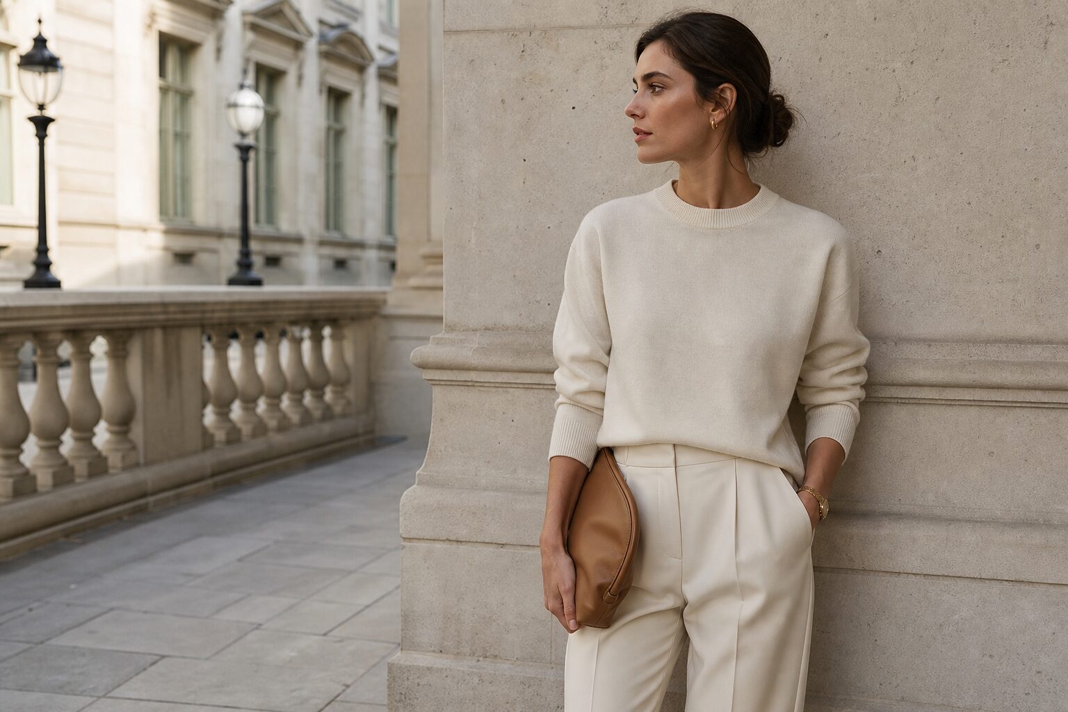

For buyers, merchandisers and brand teams, knowing How to Create a Quiet Luxury Look with Simple Pieces is increasingly useful. The mood suits boardrooms, boutique retail, hospitality uniforms and premium product styling because it feels calm, expensive and practical. Quiet luxury is not about showing labels or chasing trends. It is about restraint, quality, proportion and finish. Simple pieces do the work when every choice looks considered.
Why Quiet Luxury Works in Commercial Settings
In a B2B context, quiet luxury helps create trust without noise. It gives a showroom, studio, office or collection a polished identity while leaving space for the product or service to lead. Clients notice the absence of clutter as much as the presence of fine materials. That balance is valuable for sectors where confidence, discretion and longevity matter. A muted cashmere jumper, a sharp wool trouser, a satin shirt or a smooth leather loafer can signal standards before anyone speaks.
How to Create a Quiet Luxury Look with Simple Pieces
The easiest route is to edit rather than add. Choose fewer garments or objects, then make each one earn its place. A quiet luxury look often begins with a narrow palette, consistent textures and shapes that sit well on the body or in the room. Avoid anything too shiny, loud or obviously seasonal. The result should feel effortless, but it is built through careful decisions.
Use this simple editing checklist when developing a polished scheme:
- Select versatile base colours such as navy, camel, ivory, charcoal, black and soft grey.
- Limit visible branding, oversized hardware, busy prints and high-contrast logos.
- Prioritise cut, drape, handle, stitching, weight and practical durability.
- Repeat one material story, for example wool with leather, or linen with brushed metal.
For businesses, this approach is efficient. Simple pieces can be restyled across seasons, campaigns and client appointments. They also reduce the risk of a look ageing quickly, which matters when budgets must work hard.
Build the Foundation: Fabric, Fit and Finish
Luxury is often felt before it is named. Fabric should have substance, softness or structure, depending on the purpose. A cotton poplin shirt needs crisp edges. A wool blazer should hold its line. A knit should recover after wear, not sag at the cuff. In interiors or product presentation, the same rule applies: matte ceramics, fine timber, weighty paper and unforced textures usually look richer than glossy substitutes.
Choose pieces with quiet structure
Structure gives simple items authority. For clothing, look for clean shoulder lines, straight hems, properly set sleeves and trousers that fall without pulling. For retail displays, choose rails, plinths and surfaces with plain geometry. The eye reads order as quality. It should not have to work around wrinkles, weak seams, mismatched hangers or distracting props.
Keep care standards visible
Quiet luxury collapses when maintenance is poor. Steamed garments, polished shoes, lint-free upholstery and clean glass make the simplest piece look intentional. In client-facing environments, small marks can feel louder than design features. Regular care routines protect both appearance and margin, because pieces last longer and need replacing less often.
Shape a Refined Colour Palette
Colour is where many quiet luxury schemes either succeed or become bland. Neutrals work best when they have depth. Think warm stone instead of flat beige, deep espresso instead of harsh brown, and cream rather than bright white. A restrained palette does not need to be colourless. Forest green, oxblood, ink blue and muted aubergine can all feel refined when used sparingly.
For visual merchandising or office styling, build contrast through tone rather than pattern. A charcoal coat against a pale wall, or a cream chair beside a dark oak table, has more presence than a busy mix of colours. The finish is quieter and more useful for photography, meetings and daily use.
Use Accessories as Punctuation, Not Decoration
Accessories are powerful because they sit close to the point of contact. A slim belt, a plain watch, a silk scarf, a leather folio or a ceramic vase can sharpen the whole look. The test is whether the item adds clarity. If it competes for attention, remove it. Negative space is part of the quiet luxury language.
Good accessory choices often share three qualities:
- Simple shapes that are easy to understand at a glance.
- Materials that improve with careful use, such as leather, wool, brass or stone.
- Scale that suits the wearer, product, room or display area.
This restraint is especially important for B2B imagery. Buyers and partners should understand the offer quickly. An over-styled scene may look creative, but it can obscure the commercial message.
Common Mistakes to Avoid
The most common mistake is assuming quiet luxury means expensive minimalism. Price alone does not create the look. A costly item can still feel wrong if it is tight, shiny, badly cared for or surrounded by clutter. Another mistake is removing too much personality. The best schemes include a human detail: a softened sleeve, a hand-thrown bowl, a vintage chair or a book with a plain cloth cover. These touches stop restraint becoming sterile.
Frequently Asked Questions
Is quiet luxury suitable for corporate wardrobes?
Yes. It works well because tailored basics, calm colours and quality fabrics look professional without appearing showy or distracting in meetings.
Can simple pieces still look distinctive?
They can, when proportion, texture and styling are precise. Distinction comes from balance, not from excessive colour, logos or decoration.
What fabrics support a quiet luxury look?
Wool, cotton, silk, linen, suede and smooth leather are reliable choices, provided they suit the season, setting and care routine.
How can retailers present quiet luxury affordably?
Retailers can focus on steaming, spacing, consistent hangers, muted backdrops and strong lighting before investing in major fixtures or expensive props.
Does quiet luxury work beyond fashion?
Yes. The same principles apply to interiors, packaging, hospitality, product styling and branded environments, where calm materials, refined colour and thoughtful spacing can suggest confidence without visual noise or wasteful excess across many client-facing commercial settings.