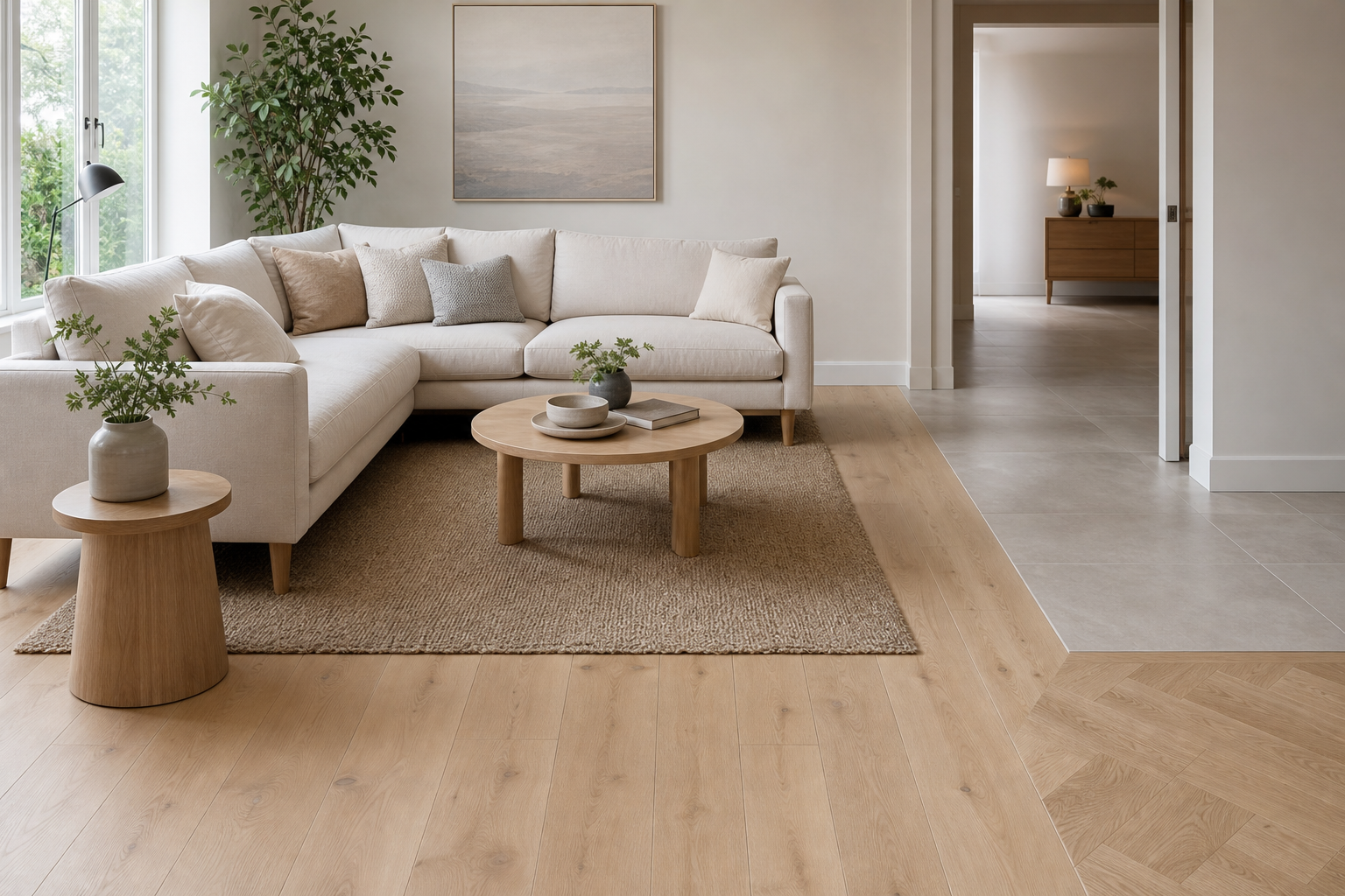

Which Flooring Works Best with Light-Coloured Furniture? It is a practical question for offices, hotels, showrooms, care settings and managed residential schemes where pale desks, sofas, counters or storage create a calm, open look. The right floor should support that brightness without making the space feel flat, cold or difficult to maintain. For B2B interiors, the decision also needs to balance brand style, footfall, cleaning routines, safety and long-term value.
Why Light-Coloured Furniture Changes the Flooring Decision
Light-coloured furniture reflects more light and tends to make rooms feel larger. White, cream, pale oak, soft grey and beige pieces can create a clean and modern interior, but they also leave less room for error. A floor that is too similar in tone may make furniture blend into the background. A floor that is too dark can create strong contrast, which may be striking but not always suitable for relaxed working or hospitality environments.
Texture matters as much as colour. Smooth pale furniture beside a flat, glossy floor can look clinical, especially under bright commercial lighting. A slightly textured wood effect, woven vinyl, carpet tile or matt stone finish can add depth and make the scheme feel more considered.
In business spaces, flooring must also work with practical pressures. Reception areas, meeting rooms, dining spaces and corridors may all contain light-coloured furniture, yet each area has different demands. A successful specification gives visual balance while supporting durability and simple maintenance.
Which Flooring Works Best with Light-Coloured Furniture?
The best flooring for light-coloured furniture is usually one that provides gentle contrast, visible texture and a tone that suits the use of the room. Mid-toned floors are often the safest choice because they anchor pale furniture without overpowering it. Warm oak, natural walnut, taupe, soft greige, muted stone and patterned neutrals can all work well.
For contemporary offices, a warm grey or light oak floor can keep the atmosphere fresh while avoiding a washed-out effect. In hospitality interiors, deeper timber tones, terrazzo looks or textured carpet can add comfort and character. In retail showrooms, flooring should help products stand out, so the best option may be a restrained surface that does not compete with display furniture.
Useful combinations include:
- Pale oak furniture with warm mid-oak flooring for a natural, coordinated finish.
- White desks with grey carpet tiles for a professional office scheme with acoustic comfort.
- Cream seating with taupe luxury vinyl tile for a practical yet softer hospitality look.
- Light grey furniture with charcoal accents in the floor for definition without harsh contrast.
- Blond wood furniture with stone-effect flooring for a clean, architectural feel.
The key is to test samples together in the actual lighting conditions. Daylight, LED colour temperature and shadow can all alter how pale furniture and flooring appear.
Commercial Flooring Options That Pair Well
Different flooring types offer different benefits when used with light-coloured furniture. The best choice depends on the setting, expected wear and the impression the business wants to create.
Luxury vinyl tile is popular in many commercial interiors because it can offer wood, stone or abstract effects with a resilient surface. With light furniture, LVT in warm oak, muted concrete or soft stone can add visual structure. It is particularly useful where cleaning, comfort underfoot and design flexibility are priorities.
Carpet tiles are a strong option for offices, meeting rooms and shared workspaces. They soften sound and can introduce subtle pattern. With pale furniture, a flecked grey, beige, blue-grey or heathered neutral tile can hide everyday marks better than a completely plain light carpet. Modular replacement can also be useful in busy areas.
Engineered wood can bring quality and warmth to executive suites, hospitality lounges and premium retail spaces. It pairs well with light furniture when the timber has enough grain and depth. Very pale wood on pale furniture can work, but it needs contrast from walls, rugs, accessories or joinery to avoid looking unfinished.
Porcelain tiles and stone-effect surfaces suit entrances, cafés, washrooms and high-traffic zones. When furniture is light, a stone-look floor in limestone, concrete, travertine or slate tones can ground the interior. Matt finishes generally feel more understated than high-gloss finishes and may reduce glare.
Rubber and linoleum can also work in education, healthcare and civic spaces. Their colour ranges allow designers to choose warm neutrals or soft muted shades that complement light furniture without creating a domestic appearance.
Colour, Contrast and Texture in Professional Interiors
A flooring scheme should not be judged by colour alone. The relationship between furniture, floor, wall colour and lighting creates the final impression. For many UK commercial projects, a balanced palette is easier to live with than a dramatic one.
If the furniture is white or pale grey, warmer flooring can prevent the space feeling sterile. If the furniture is cream or light beige, cooler grey flooring can make the scheme feel sharper and more modern. If furniture has a pale timber finish, the floor should either be clearly lighter, clearly darker or noticeably different in texture. Slight mismatches between two wood tones can look accidental.
Pattern can help, but it should suit the brand and room size. A subtle herringbone, linear carpet tile or terrazzo effect can add interest beneath simple furniture. In contrast, a bold floor pattern may distract from the furniture or make flexible layouts harder to manage.
For B2B environments, the floor often has to support wayfinding and zoning. A business may use one main flooring tone, then change texture or colour to define breakout areas, waiting zones or circulation routes. Light-coloured furniture can then remain consistent while the flooring quietly organises the space.
Practical Specification Factors for UK Workplaces
A floor that looks good with light-coloured furniture must still perform under daily use. Decision-makers should consider the full lifecycle, not only the first impression.
Important factors include:
- Footfall level: entrances and corridors need tougher finishes than private offices.
- Cleaning regime: pale surroundings can show dust, so flooring should suit realistic maintenance schedules.
- Slip resistance: especially important in hospitality, healthcare, washrooms and entrance areas.
- Acoustics: carpet tiles or acoustic-backed flooring can improve comfort in busy offices.
- Replacement and repair: modular products may reduce disruption in active workplaces.
- Lighting: bright overhead lighting can increase glare on glossy or very pale floors.
- Brand tone: flooring should support the company’s identity, whether calm, premium, creative or practical.
It is also worth considering how the floor will look as furniture changes. Many organisations refresh furniture more often than flooring. A versatile floor in a mid-neutral tone can adapt to future pale, dark or colourful pieces more easily than a highly specific trend-led finish.
Maintenance perception is another issue. Light-coloured furniture can already require careful cleaning, especially in hospitality and client-facing spaces. Pairing it with a very pale floor may increase the sense of upkeep, even where the material is technically durable. A lightly patterned or mid-toned floor can be more forgiving.
Frequently Asked Questions
Is dark flooring suitable with light-coloured furniture?
Yes, dark flooring can work very well with light-coloured furniture when the room has enough light and space. It creates strong contrast and can make pale furniture appear more defined. However, very dark floors may show dust, scuffs or footprints more clearly in high-traffic commercial areas.
Should flooring match light wood furniture exactly?
Exact matching is usually difficult and often unnecessary. If two wood tones are almost the same but not identical, the result can look unplanned. A better approach is to choose a floor that is clearly lighter, darker or different in grain, so the relationship looks intentional.
What is the safest flooring colour for flexible commercial interiors?
A mid-toned neutral is often the safest choice for flexible interiors with light-coloured furniture. Warm grey, greige, taupe, natural oak and muted stone shades can work across many settings. These colours provide contrast, hide everyday marks reasonably well and suit future furniture changes.