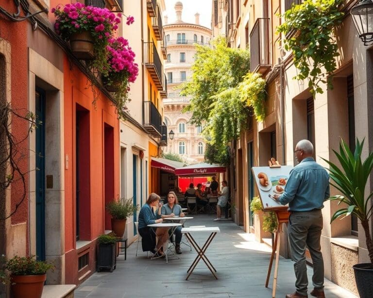
Small homes and rooms are a defining feature of British living. Many readers will recognise studio flats, box rooms under 7m², narrow hallways and compact living-dining areas as everyday realities. Choosing the right paint can transform these spaces without structural change.
This guide answers what paint colours work best for small spaces and offers practical, stylish small room paint ideas. The aim is to make a room feel larger, improve natural light distribution and set the mood you want — calm, energised or airy — while keeping the footprint the same.
Colour works by reflecting light, simplifying visual boundaries and guiding the eye. Paint finish, light source and room function all interact with hue to create the illusion of space. Effective choices can turn small rooms into places that feel open and purposeful.
Practical considerations matter. Test sample pots on different walls, view them at morning and evening light, and consider existing floors and furniture. Think about north- or south-facing aspects common in UK homes; they change how a shade reads throughout the day.
For reassurance, trusted UK brands such as Farrow & Ball, Dulux, Little Greene and Crown offer wide palettes, sample pots and technical advice on sheen and coverage. Their ranges are useful when hunting for the best colours for small rooms or paint colours to make room look bigger.
Later sections will explain how light influences perceived space, recommend the best neutrals, explore colour temperature and give clear colour strategies to visually enlarge rooms. You’ll also find room-by-room suggestions tailored to compact space decorating UK needs.
What paint colours work best for small spaces?
Choosing the right colours for compact rooms lets you play with perception. Light, reflectivity and temperature of paint all shape how big a space feels. Use simple tests and trusted sample pots UK to see how tones behave through the day.
How light influences perceived space
Natural light in the UK varies by orientation. North-facing rooms tend to have cooler, bluish daylight while south-facing rooms get warmer, golden light. That shift alters how a paint looks once it is on the wall.
Artificial lighting changes colour rendering too. LED bulbs can read as crisp and cool, halogens push warmer, incandescent lamps cast a yellow glow. Always view a large test patch under the room’s actual lighting at different times.
Light reflection matters. Pale, higher-value colours bounce more light and make walls seem to recede. Reflectivity paint finishes such as satin or eggshell throw back more light than matt. Matt hides imperfections while glossier finishes boost brightness, so weigh aesthetics against practicality.
Small or obstructed windows need brighter, cooler neutrals to compensate. Mirrors, glass and metallic accents help amplify daylight and create depth. Place reflective surfaces opposite windows to spread light across the room.
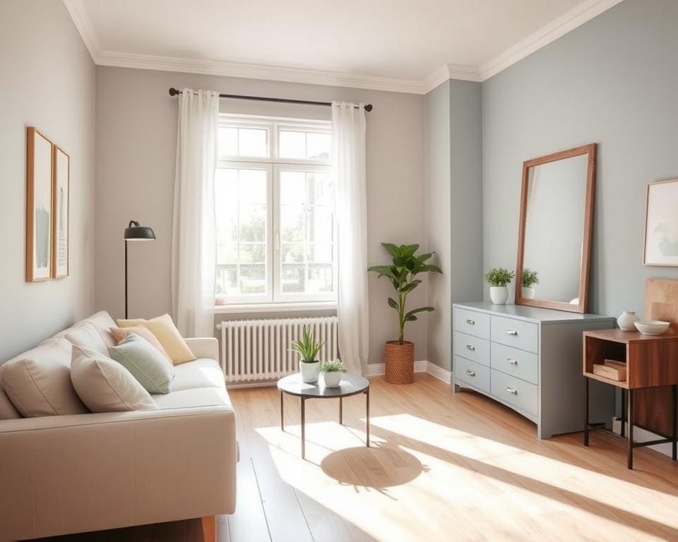
Best neutrals for compact rooms
Choose warm off-whites, soft greys, pale beiges and muted greige tones to add subtle depth without closing in a space. Examples from UK ranges include Farrow & Ball’s Wevet and Ammonite, Dulux Natural Calico and Valspar Pale Dew as reference points to try.
Undertones change everything. Blue or green tints read fresher in sunny south-facing rooms. Pink or yellow undertones can cosset cool north-facing spaces. Test larger patches rather than small swatches to judge the whole-room effect.
For trim and joinery, opt for a slightly lighter or glossier version of the wall colour. That creates gentle definition without sharp contrast and keeps the room feeling open.
Practical tip: use sample pots UK to paint full-height test areas. Live with those patches across different times and light conditions before committing.
Using colour temperature to expand a room
Cool colours such as pale blues, soft greens and cool greys tend to visually recede, making walls feel further away. Warm colours — creams, warm beiges and muted terracottas — advance and make a room feel cosier. Decide whether you want perceived extra space or a snug, inviting mood.
For maximum openness, select desaturated cool tones. Low-saturation pastels and muted shades preserve spaciousness better than vivid, saturated hues. Pair a cool pale on the walls with warmer textiles and accessories to avoid a clinical feel.
Alternatively, use a warm neutral base with cool accents to maintain a breezy look while keeping comfort. Consider seasonal shifts and how the room’s colour temperature will change through the day before finalising your choice.
- Test sample pots UK on different walls and observe at morning, afternoon and evening.
- Match reflectivity paint finishes to the room’s condition: matt for imperfect walls, eggshell for balance, gloss for trim.
- Balance warm vs cool paint for small spaces according to the room’s function — airy for shared areas, warmer for restful bedrooms.
Colour strategies to visually enlarge small rooms
Small rooms respond well to considered colour plans. Use measured choices to blur boundaries, guide the eye and reduce clutter. The following practical ideas show how subtle paint decisions can create roomy, calm interiors without major work.
Monochrome and tonal schemes
Using a single hue in varying tints and shades creates a unified field that helps a room feel larger. Paint walls, trim and cupboards in coordinated tones so furniture and textiles sit within the scheme rather than interrupt it.
Consider building a palette from Farrow & Ball or Dulux collections. Pick three values of the same colour, for example soft grey, mid-grey and a near-white tint, to keep transitions smooth and simple. Monochrome paint schemes reduce visual noise and make accessorising easier.
Accent walls and restrained contrast
An accent can add depth without chopping space when contrast is gentle. Choose a muted, darker tone for the shortest wall or the wall behind a focal point such as a bed or fireplace.
Use narrow panels, painted shelving backs or cabinetry in a deeper tone as an alternative to a full accent wall. Follow accent wall tips small rooms by tying the accent to textiles and artwork so the colour integrates with the room.
Ceiling and trim techniques to add height
Painting ceilings to add height starts with a lighter or cooler shade than the walls. A soft, cool white reads less stark than pure white and still lifts the room.
For a cocooning effect, use the same colour as the walls in a lighter tint to blur the top edge of the room. Give skirting and architraves a slightly higher sheen to reflect light and make mouldings appear to lift, keeping contrast small so the space does not feel chopped.
Vertical and horizontal painting tricks
Thin, subtle vertical stripes create an illusion of height when you use soft tonal variations instead of stark bands. Test stripe widths and colours in the room’s light before painting.
Horizontal bands or a darker lower dado can widen a narrow room when kept low and in gentle contrast. Two-tone walls with the bottom third slightly darker and the top two-thirds lighter can make ceilings seem higher.
Paint built-in units the same colour as the wall to make them recede. Use stripe painting techniques UK sensibly and rely on quality tape and samples to avoid mistakes.
Choosing colours by room function and mood
Match paint choices to a room’s purpose and the mood you want to create. For restful sleep, bedroom paint colours small rooms tend to work best when they are soft, desaturated blues, sage greens, warm greys or pale lavenders. In north-facing bedrooms, add subtle warm undertones; in sunlit rooms, cooler pastels help keep the space calm. Anchor the bed with a slightly darker, low-contrast headboard wall to avoid closing the room.
For sociable lounges and living rooms, choose warm neutrals, muted greens, greys or a pale warm terracotta to encourage conversation while keeping the room feeling open. Harmonise wall colour with primary furniture and rugs so the eye travels smoothly. Use layered textiles and carefully placed accent pieces to add depth without heavy wall colour; these tactics support popular lounge colours small flats and make decorating more flexible.
Kitchens benefit from bright, clean neutrals, pale greys or soft greens and blues that reflect light and read as hygienic. Small kitchen paint ideas include painting lower cabinetry a tone darker than walls to ground the room while keeping upper units light to open sightlines. Opt for scrubbable, washable finishes such as Dulux Easycare or Crown Trade alternatives and consult technical data for durability.
Bathrooms and utility rooms respond well to crisp cool tones—pale aqua, light grey, soft mint—or warm off-whites to boost perceived cleanliness. Use mould-resistant, high-humidity paints from reputable ranges like Johnstone’s or Dulux bathroom products and add mirrors or glossy tiles to amplify light. For hallways and narrow spaces, a continuous neutral scheme, lighter ceilings and matching doors reduce visual breaks and prevent a tunnel effect.
Finally, employ mood-based colour selection UK by introducing personality through textiles, artwork, metallics and painted shelf backs rather than committing to bold wall colours. Test with sample pots on different walls at day and night, choose eggshell or matt for walls and satin or gloss for trims where needed, and prefer a pale desaturated neutral as a reliable base when uncertain. Families may favour slightly darker, washable neutrals to hide marks while retaining a flexible palette for future updates.