In today’s fast-paced business environment, understanding what makes a dashboard truly actionable is essential for driving data-driven decisions. Actionable data dashboards play a crucial role in transforming complex datasets into clear, concise insights that empower users to make timely and informed choices. Research reveals that a significant 63% of organisations leverage dashboards to facilitate decision-making, underscoring their prominence and the critical need for effective design. By focusing on the essence of actionable dashboards, we can unlock the full potential of data, enabling organisations to navigate challenges and seize opportunities with confidence.
Understanding Actionable Data Dashboards
In an age where data influences decision-making, the concept of actionable data dashboards becomes increasingly significant. Businesses need to embrace dashboards that empower users to derive insights promptly and effectively. Actionable dashboards must go beyond mere presentation; they need to cater to the dynamic needs of businesses, fostering a proactive approach to data analysis.
The Importance of Actionability
Actionability transforms raw data into strategic insights. When users engage with actionable data dashboards, they can swiftly respond to trends, challenges, and opportunities within their industries. Such dashboards are equipped to support fast-paced environments where every decision counts. This capability not only enhances productivity but positions businesses to outpace competitors in various sectors.
Characteristics of Actionable Dashboards
Effective user-friendly dashboards share several defining features that contribute to their actionability. First, clarity is paramount; users must easily interpret data without wading through unnecessary complexity. Simplicity follows suit, ensuring that essential metrics are highlighted while extraneous information is kept at bay. Integrating relevant data points ensures that users focus solely on what truly matters.
- Clarity: Users should grasp key insights at a glance
- Simplicity: Avoiding clutter leads to easier navigation
- Relevance: Prioritising metrics that align with user goals

The benefits of leveraging actionable data dashboards are profound, enabling businesses to unlock a wealth of potential by making informed, timely decisions. A well-designed dashboard can pave the way for enhanced performance and strategic growth, ensuring that organisations retain their competitive edge.
What makes a dashboard truly actionable?
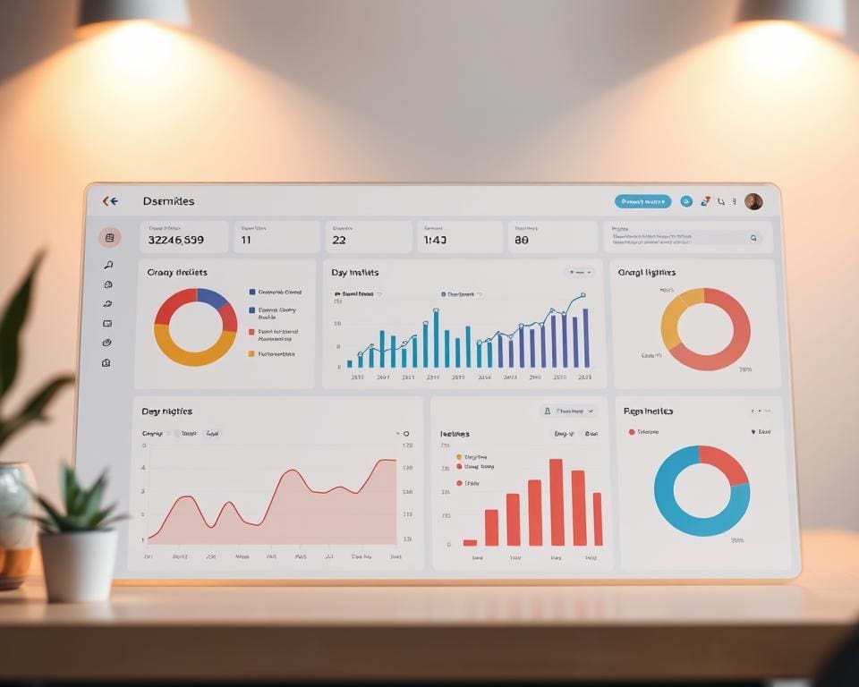
Effective dashboards possess distinct features that make them invaluable for organisations striving for clarity and actionable insights. These dashboards allow users to tailor their views according to specific needs, integrating real-time data with ease. Utilising compelling visual representations such as graphs and charts enhances understanding, enabling teams to navigate complex data effortlessly.
Key Features of Effective Dashboards
When examining effective dashboards, several key features emerge:
- Customisability: Allow users to adjust layouts according to their preferences.
- Real-time data integration: Enable quick responses to the latest information.
- Visualisation tools: Utilise charts, graphs, and dynamic indicators to display insights clearly.
- Accessibility: Ensure that data is easily obtainable across various devices.
Real-Life Examples of Actionable Dashboards
Numerous real-life examples showcase how actionable dashboards drive data-driven decisions. Tableau stands out with its user-friendly interface and interactive features, empowering organisations to track key performance indicators effectively. Looker offers robust data exploration capabilities, enabling businesses to gain insights and respond to market trends promptly. These platforms exemplify how effective dashboards can enhance operational efficiency and support strategic goals.
Data Visualisation Techniques for Enhanced Insights
Effective data visualisation plays a critical role in providing deeper insights from dashboards. The choice of visuals can significantly impact how information is perceived and understood by users. Selecting the appropriate visuals ensures that the data speaks clearly and efficiently, facilitating better decision-making.
Choosing the Right Visuals
Different types of data require distinct methods of visualisation. For example:
- Bar charts excel in displaying comparisons across categories, allowing quick assessments of differences.
- Line graphs are optimal for illustrating trends over time, making it easy to spot fluctuations in data.
- Pie charts can effectively show proportions, although they should be used judiciously for clarity.
The right visuals enhance data comprehension and highlight the most critical insights in a digestible format.
Integrating Interactivity in Visualisations
The incorporation of interactive dashboard features transforms static data into lively, engaging experiences. Users can drill down into data sets, filter information based on parameters, and explore relationships between variables. This level of interactivity allows for:
- Enhanced user engagement, with studies indicating that interactivity can boost engagement by nearly 50%.
- More profound understanding of data, as users can navigate through different layers of information based on their needs.
Such interactive elements make the data findings not just observable but also actionable, empowering users to derive insights effectively.
Key Performance Indicators and Their Role
Key performance indicators (KPIs) serve as vital benchmarks in the world of actionable dashboards. When organisations aim to enhance their decision-making process, the selection of appropriate KPIs becomes immensely important. KPIs should resonate with specific business objectives, creating a pathway to informed and data-driven decisions. Indicators such as sales growth, customer retention, and market share encapsulate the essence of organisational goals.
Selecting the Right KPIs
The first step towards effective KPI utilisation is identifying those indicators that will have the most significant impact on performance. Potential KPIs should not only reflect current successes but also highlight areas for improvement. Considerations for selection might include:
- Relevance to strategic objectives
- Measurability and clarity
- Actionability derived from outcomes
Aligning KPIs with Business Objectives
After selecting the appropriate KPIs, ensuring their alignment with broader business objectives is crucial. Such alignment guarantees that the information derived from the dashboard is not merely statistical but rather serves to advance strategic aims. Aligning KPIs should lead to more coherent decision-making, encouraging teams to pursue data-driven decisions that drive overall effectiveness. When KPIs directly correlate with organisational aspirations, they enhance the relevance and impact of insights.
Dashboard Design Best Practices
Creating user-friendly dashboards requires a strategic approach to design that prioritises clarity and functionality. Employing whitespace effectively allows users to digest information without feeling overwhelmed. This principle not only enhances aesthetics but also contributes significantly to the overall user experience, making the dashboard more engaging and easier to navigate.
Consistency in colour schemes and typography is essential for effective dashboard design. By establishing a cohesive visual language, users can readily identify key information and patterns. This approach fosters a seamless interaction with the dashboard, reinforcing the importance of maintaining visual harmony to support usability.
Moreover, implementing a logical information hierarchy guides users naturally through the dashboard. By prioritising critical data and organising it intuitively, designers can facilitate quicker decision-making processes. Research shows that adhering to dashboard design best practices can enhance usability by up to 30%, underscoring the significant benefit of investing time and resources into creating intuitive, user-friendly dashboards.